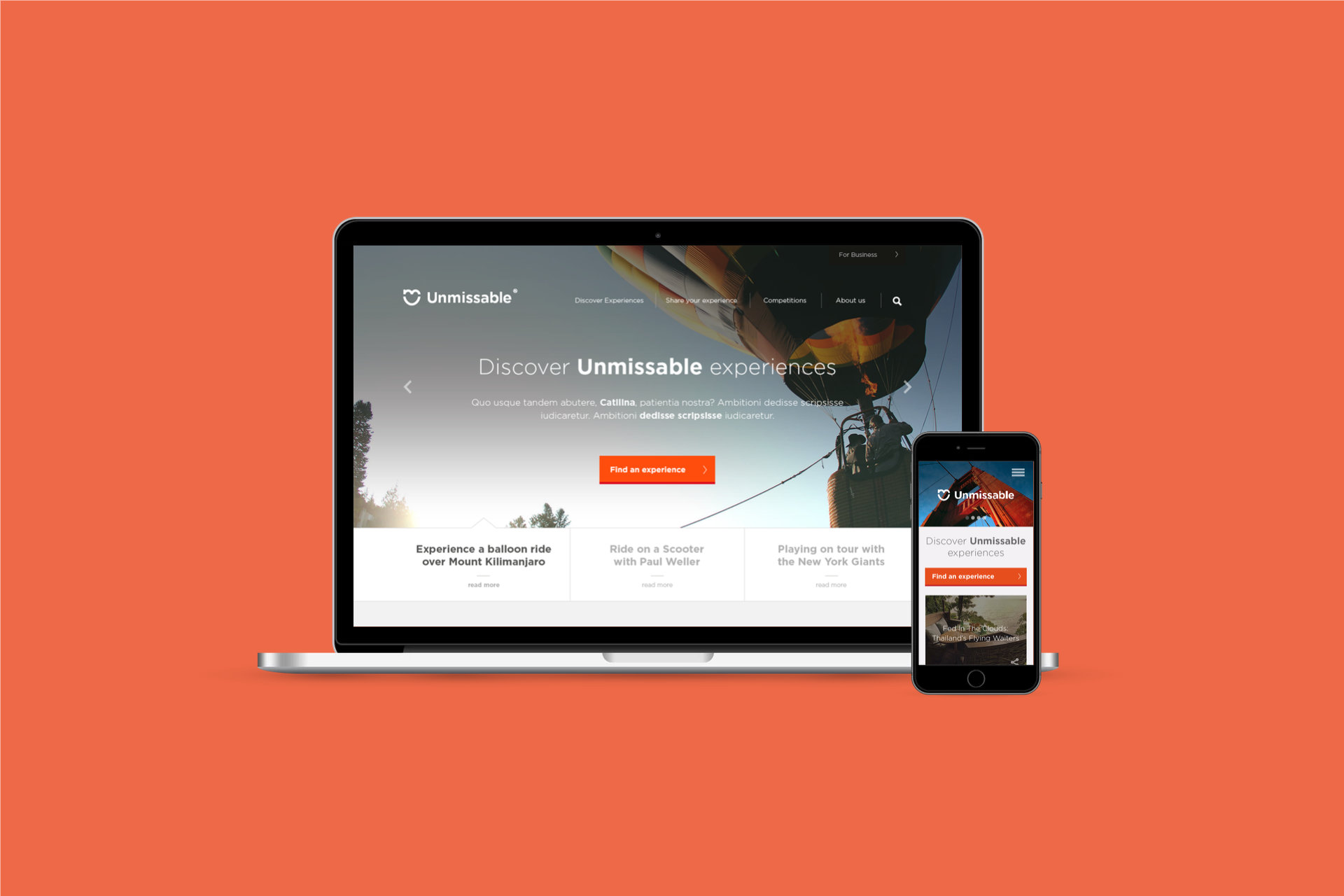
Unmissable.com set out to be the place people come to share the experiences that make life better and discover new ones. Not a travel guide, not a listings site, not a lifestyle blog. I designed the website, the journeys through it and the design language that held it together, from wireframe to front end.
At a glance
- Client: Unmissable.com, London
- My role: Freelance interaction and visual designer
- When: 2015
- Deliverables: user flows, wireframes, responsive designs, sponsored content templates, front end HTML and CSS
The brief
The editorial idea was clear and strict. Every story had to be about a specific experience that a reader could actually go and have: a balloon ride over Kilimanjaro, dinner served by waiters on zip wires in Thailand, a hot air balloon into the edge of space. The best image goes at the top. Lists of ten were banned, because if nine of them were truly Unmissable they'd each get their own story.
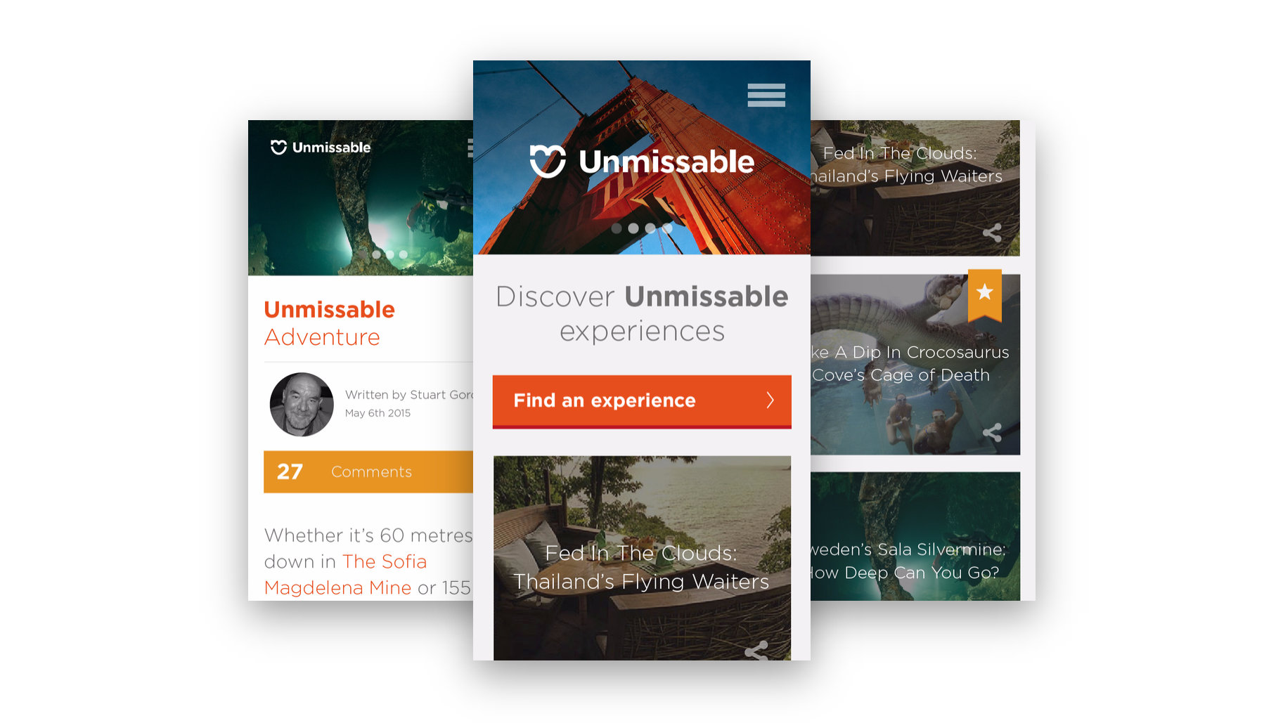
The site had to carry that confidence without shouting, work as well on a phone as a laptop, and earn its keep. Readers needed to be able to enquire about or buy an experience, enter prize draws and competitions, and brands needed a home for sponsored content that still felt like Unmissable.
Mapping the journeys first
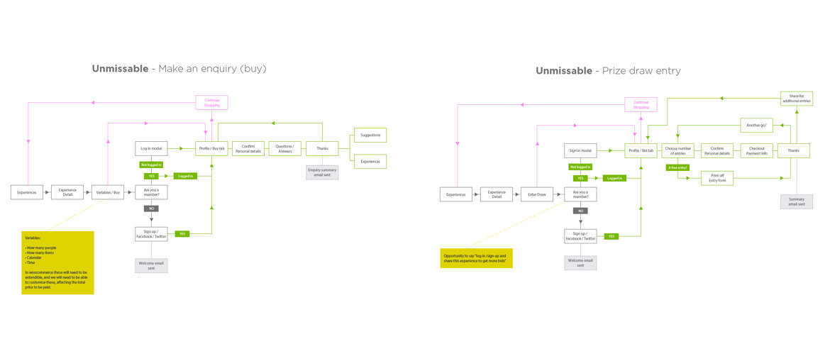
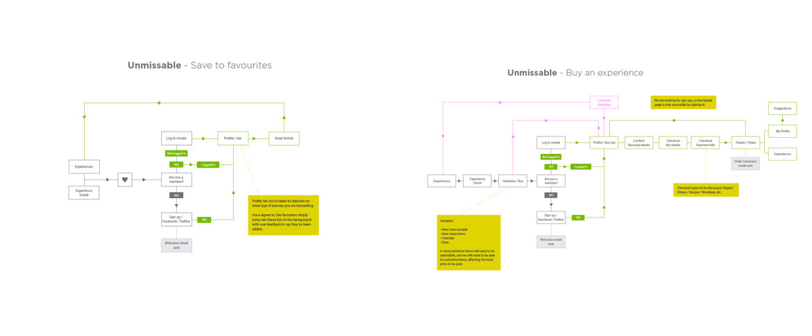
Before any visuals I drew the flows that the business depended on:
- Make an enquiry or buy an experience, with the variables that change the price, how many people, how many items, which dates.
- Enter a prize draw, including how many entries to buy and sharing for extra entries.
- Save to favourites, which quietly asks you to sign up the first time and then remembers you.
Each flow handled the logged in and logged out cases, with sign up through Facebook or Twitter to keep friction low, and a welcome email at the end.
Wireframes
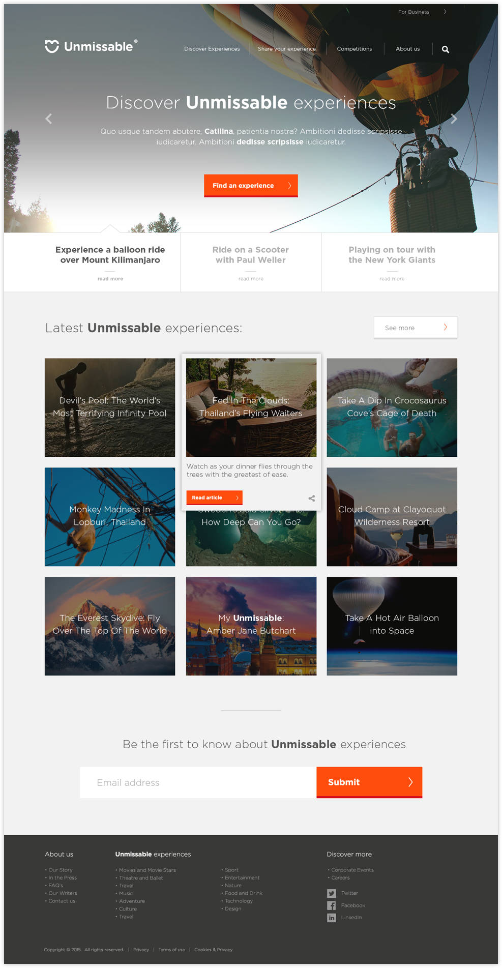
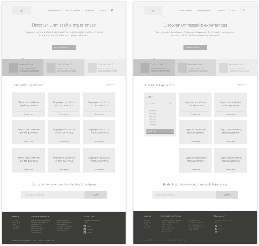
The wireframes set the pattern the whole site follows: a full width hero, three featured stories pulled out beneath it, then a grid of experiences with filters, and a newsletter sign up before the footer.
The design language
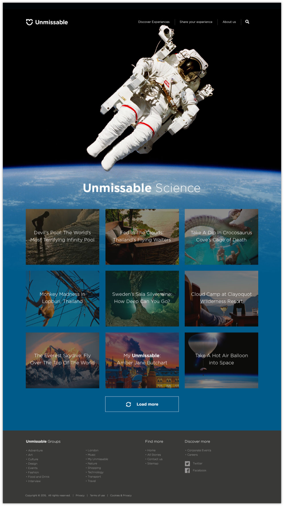
The brand had a bold red, a heart mark and Gotham. I built a design language on top of that which lets the photography do the talking: big images with the headline set over them, white space around the stories, and the red reserved for the one action you should take on each page.
Category pages each get a hero that sets the mood, like the astronaut drifting above the Earth on Unmissable Science.
Sponsored content
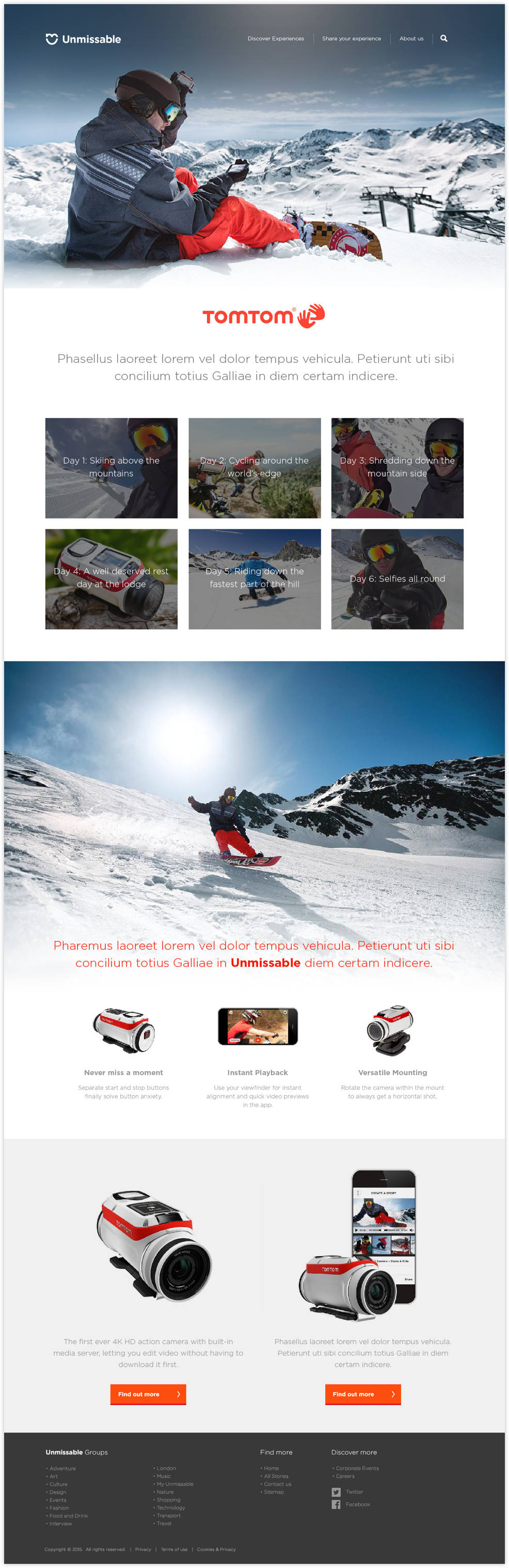
Brands wanted to be part of it. I designed a template for sponsored stories that gives a partner room to tell their own story, a day by day photo diary and product features, inside the same grid and type as everything else, so a reader never feels they've left the site.
What I learned
A strict editorial rule is a gift to a designer. "The best image goes at the top and there's only ever one thing to do" wrote most of the layout for me.